6 Best Tips for Choosing Recessed Lighting Color Temperature?

Time:2026-10-17 Author:Liam
0%

Choosing recessed lighting color temperature is more than selecting a number on a product box. It affects comfort, visibility, finishes, and the atmosphere of every room. The U.S. Department of Energy reports that LED products use at least 75% less energy and last up to 25 times longer than incandescent lamps. Efficiency matters, but color quality matters too. A technically efficient light can still make a kitchen feel harsh or a bedroom feel sterile.

So, how to choose the right color temperature for recessed lighting? Start with the room’s purpose, surface colors, daylight exposure, and evening activities. Warm white, usually 2700K to 3000K, can complement wood floors and soften bedrooms. Neutral white, around 3500K, often supports kitchens, bathrooms, and home offices. Cooler 4000K light may improve visual clarity, although it can appear overly blue against warm interior finishes. Small differences become visible on white cabinets, gray walls, and polished stone.

The Illuminating Engineering Society emphasizes evaluating lighting through visual comfort, task needs, glare control, and color appearance rather than relying on one specification alone. CIE guidance also recognizes that color appearance depends on the surrounding environment and observer perception. There is no perfect Kelvin number. That sounds simple, but it is not. This guide presents six practical tips, including color rendering, dimming behavior, layered lighting, and room-by-room testing. Use samples before committing; a ceiling mock-up viewed at night often reveals problems that a daytime product photo hides. Some recommendations may still require adjustment, because real homes rarely behave like showroom displays.
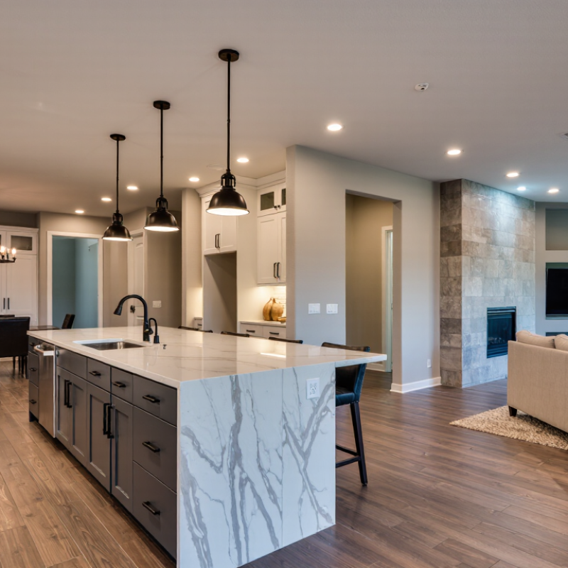
6 Best Tips for Choosing Recessed Lighting Color Temperature?

Understanding Recessed Lighting Color Temperature

6 Best Tips for Choosing Recessed Lighting Color Temperature

Understanding Recessed Lighting Color Temperature

Color temperature describes how light appears, measured in Kelvin (K). Lower values create a warm, amber glow, while higher values look cooler and bluer. Warm feels calm. For bedrooms and living rooms, 2700K to 3000K usually supports a comfortable atmosphere. Kitchens, bathrooms, and work areas often benefit from 3500K to 4000K for clearer visual detail.

Match the recessed lights with existing fixtures. A warm ceiling light can look awkward beside a cool pendant or under-cabinet strip. Check the room during daytime and after sunset. Natural light changes the result. Small differences matter. Also examine the color rendering index, or CRI. A CRI of 90 or higher generally shows wood, fabric, food, and skin tones more accurately. The Kelvin number alone cannot guarantee good color quality.

Test one sample before installing every fixture. Place it above the main seating area, then view it from different corners. Dimming compatibility matters, too; some lights shift color or flicker with unsuitable controls. I once underestimated how gray walls reflected cool light, making the room feel harsher than expected. That mistake taught me to assess paint, flooring, and daylight together. A flexible color-selectable fixture can help, but changing options may encourage indecision. Choose the setting that supports the room’s actual use, not only its showroom appearance.

Matching Color Temperature to Each Room’s Function

6 Best Tips for Choosing Recessed Lighting Color Temperature

Tip 1 Use 2700K lighting in bedrooms and living rooms. Its warm glow supports rest, conversation, and softer evening routines.

Tip 2 Choose 3000K for dining areas and hallways. It keeps food colors pleasant without making the space feel sleepy. In my experience, this range feels welcoming but still clear.

Tip 3 Select 3000K to 3500K for kitchens and bathrooms. These rooms need accurate visibility for food preparation, grooming, and cleaning.

Tip 4 Use 3500K or 4000K in home offices, workshops, and study corners. Cooler light can improve visual focus during detailed tasks. It is not magic, though. Brightness, glare, and fixture placement also matter.

Tip 5 Reserve 4000K for laundry rooms, garages, and utility spaces. These areas benefit from crisp light that reveals dust, stains, and small objects.

Tip 6 Treat 5000K lighting carefully in homes. It may suit a workbench, but it can feel harsh in a bedroom or lounge. I once recommended a cooler temperature for a busy workspace, then noticed the user disliked its clinical appearance. A sample bulb would have helped.

Test the light after sunset, beside existing finishes, and under the room’s actual ceiling height. Color temperature changes how paint, wood, skin, and fabrics appear. Preferences also vary more than lighting charts suggest.

Balancing Warmth, Brightness, and Visual Comfort

6 Best Tips for Choosing Recessed Lighting Color Temperature?

Color temperature controls more than mood. It changes how bright, clean, and comfortable a room feels. Start with the room’s purpose. Choose 2700K to 3000K for bedrooms, lounges, and dining areas. Choose 3500K to 4000K for kitchens, offices, and workshops. The Illuminating Engineering Society notes that visual comfort depends on both illuminance and glare control, not color temperature alone. A bright 4000K downlight can still feel harsh when aimed at glossy counters.

Match the light to nearby surfaces. Warm light can make beige walls look richer, while cooler light may reveal blue or gray undertones. Check the color rendering index, too. The U.S. Department of Energy recommends high color rendering for spaces where accurate color matters, such as kitchens and dressing areas. Select dimmable fixtures when possible. Dimming helps balance brightness during changing daylight. Add wide beam angles for general lighting, then use narrower beams for artwork or task zones. Avoid mixing 2700K and 4000K in one sightline. It often looks accidental.

Test before installing every fixture. One sample on the ceiling can expose glare, shadows, or an uncomfortable green tint. This step is easy to skip. It should not be. ENERGY STAR reports that certified LED lighting uses at least 75% less energy than incandescent lighting, but efficiency does not guarantee comfort. The final choice should consider ceiling height, wall color, diffuser quality, and how long people occupy the room. A slightly imperfect test is better than a polished mistake.

6 Best Tips for Choosing Recessed Lighting Color Temperature

Balance warmth, brightness, and visual comfort by matching the color temperature to the room’s purpose. Color temperature is measured in kelvins (K): lower values look warmer, while higher values appear cooler and bluer.

How to choose: Use 2700K for cozy living areas and bedrooms, 3000K for versatile residential lighting, 3500K for kitchens and bathrooms, 4000K for clearer task visibility, and 5000K–6500K for workspaces or daylight-style environments.

  • 1. Match the room’s mood: Warm light creates a relaxed, inviting atmosphere.
  • 2. Consider the task: Cooler light can make detailed work feel clearer.
  • 3. Check existing fixtures: Keep adjacent lights within a similar color-temperature range.
  • 4. Think about finishes: Warm light complements wood and beige tones, while cooler light emphasizes white and gray surfaces.
  • 5. Prioritize visual comfort: Avoid unnecessarily cool light in spaces intended for relaxation.
  • 6. Use dimming when possible: Adjustable brightness helps balance illumination throughout the day.

Coordinating Ceiling Lights with Interior Colors

6 Best Tips for Choosing Recessed Lighting Color Temperature

Coordinating ceiling lights with interior colors starts with the room’s fixed finishes. Warm white light, around 2700K to 3000K, usually complements beige walls, oak floors, cream fabrics, and warm stone.

Tip 1: Match the light to the strongest color, not the smallest decoration.

Tip 2: Test a sample beside the wall at night. Paint can look surprisingly different.

Cooler light, between 3500K and 4000K, can support white cabinets, gray tile, blue accents, and clean modern interiors. However, very cool light may make warm wood appear dull or slightly orange.

Tip 3: Compare the ceiling light with flooring and countertops together.

Tip 4: Keep adjacent rooms within a similar range, unless a deliberate contrast is intended.

I have found that 3000K is a flexible choice for many living spaces. It gives white surfaces some clarity without making skin tones feel harsh. Still, there is no universal answer.

Tip 5: Use dimming when the room serves several purposes, such as dining, reading, and relaxing.

Tip 6: Check the color rendering rating before installation, because temperature alone does not guarantee natural-looking colors.

One detail is easy to miss: glossy paint can reflect light strongly. A small test fixture often prevents an expensive rethink.

Testing and Selecting the Best Temperature for Your Space

Choosing the right recessed lighting color temperature begins with testing, not guessing. Kelvin ratings describe light appearance, from warm yellow to cool white. However, numbers alone cannot predict how your room will feel.

Tip 1: Test before installing. Place adjustable lights or temporary bulbs in the actual ceiling positions. Check them during daylight, evening, and cloudy weather. A 2700K light can make wood tones feel warmer, while 4000K may sharpen white cabinets and work surfaces. I once chose a cooler temperature for a small kitchen, but it felt harsher after sunset. The sample revealed the mistake.

Tip 2: Compare materials under real conditions. Hold paint cards, flooring samples, and fabric beneath each temperature. Look for unwanted gray, yellow, or green shifts. Use the same brightness when comparing samples. Otherwise, a brighter lamp may seem better simply because it is stronger. This matters.

Tip 3: Match the room’s purpose and your visual comfort. Bedrooms often benefit from softer light, while kitchens, offices, and bathrooms may need clearer illumination. Yet personal preference matters more than a standard chart. Ask two or three people to describe the space separately. Their reactions may expose details you overlook. Also test dimming, because some lights change character or appear uneven at lower levels. My own preference has changed over time, so I now test for several evenings before making a final selection.

FAQS

What does recessed lighting color temperature mean?

It describes how light appears, measured in Kelvin. Lower values look warmer and amber, while higher values appear cooler and bluer. Warm feels calm.

Which color temperature suits bedrooms and living rooms?

Temperatures between 2700K and 3000K usually create a comfortable atmosphere. They can make wood, fabric, and skin tones feel softer. Personal comfort still matters.

Which color temperature works well in kitchens and bathrooms?

Temperatures from 3500K to 4000K often provide clearer visual detail. They can sharpen white cabinets, work surfaces, and bathroom mirrors. Test them after sunset.

Should existing light fixtures affect my choice?

Yes. Match the recessed lights with nearby ceiling lights, pendants, or under-cabinet lighting. A warm fixture beside a cool one may look awkward. Small differences show.

How can I test lighting before installing every fixture?

Place one adjustable light in the actual ceiling position. View it from the seating area and different corners. Check it during daylight, cloudy weather, and evening conditions.

How do paint and flooring change the lighting result?

Walls and floors reflect light into the room. Cool light may make gray walls feel harsher. Hold paint cards, flooring samples, and fabric under each setting.

Is Kelvin enough for choosing good recessed lighting?

No. Color temperature describes appearance, but CRI describes color accuracy. A CRI of 90 or higher usually shows food, wood, fabric, and skin more naturally.

What should I check when comparing different temperatures?

Keep brightness equal during comparisons. A brighter light may seem better unfairly. Also test dimming, because some lights shift color or flicker with unsuitable controls.

Should the room’s purpose determine the final choice?

It should guide the decision, not control it completely. Bedrooms may need softness, while offices and kitchens may need clearer illumination. I once preferred cooler light, but sunset changed my mind. Testing several evenings seems wiser.

Conclusion

Choosing the right recessed lighting color temperature can greatly influence the mood, comfort, and functionality of every room. Color temperature ranges from warm, soft tones that create a relaxing atmosphere to cooler, brighter tones that support focus and visibility. To understand how to choose the right color temperature for recessed lighting, consider each space’s primary purpose. Warm light often suits bedrooms, living rooms, and dining areas, while neutral or cool light may work better in kitchens, bathrooms, offices, and work areas.

A balanced choice should also account for brightness, visual comfort, and the colors used throughout your interior. Warm lighting can enhance wood, beige, and earthy finishes, while neutral light may complement white, gray, or modern surfaces. Before making a final decision, test different temperatures at various times of day and observe how they affect wall colors, furniture, and daily activities. This simple comparison can help you create a cohesive, comfortable, and practical lighting design.

Liam

Liam

Liam is a dedicated marketing professional with a profound expertise in the industry, where he excels at highlighting the unique advantages of our core products. With a keen understanding of market trends and consumer needs, Liam frequently updates our company’s professional blog, providing......